Having already missed 100% Design due to prior work commitments/that recession thing that happened (over now apparently) I was determined to keep my extra-curricular outings going at Interiors 2010.
As I work Primarily in Commercial Interiors right now, this was the perfect opportunity to flex some more domestic design muscles. As such I had no particular destinations or route to execute, just the need to absorb as much as I could. So starting in the corners of each hall and working from right to left/left to right was my strategy, as it is easy enough to get lost. Saying that I had nothing particular in mind is not strictly true, I did have a project in the back of my mind which requires some Art Deco influences. However, this was not a trend being observed at Interiors 2010, although the Tiffany Lamps were tempting, more so, as I have a personal desire to own one, one day.
Some of the more obvious trends I saw being followed by exhibitors were the strong Asian influences, not only in sculptures but rich opulent furnishings in reproduction Tibetan and Chinese styles and animal skins in animal hide rugs and upholstery. A less obvious trend were small clusters of very patriotic British merchandising with Union Jack embellished fabrics and furniture. Lots of stands like Coach House, displaying a multitude of lamps rugs and 1930’s travellers trunks style storage and the quintessential Storm Lamps. Opulent bespoke linens from Charlotte Thomas were amongst the indulgent, and high end luxury, for my purse string anyway.
Being who I am, however, more drawn to the unusual, and for me, more interesting stands, not just by name alone (The House of Ugly Fish with their fused glass art, being one to mention) but the usually less ornate, simple stands, smaller companies concentrating on one particular product/theme, more niche trend setters, than followers.
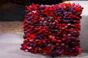
The corner stand for Dreamweavers caught my eye with their bright coloured sensual, inspirational rag and padded effect rugs and matching themed cushions, were drawing a large crowd on the Sunday I visited. With such a tactile product that people were encouraged to touch, an excitement of the senses when you have been under the glare of the Exhibitions lights for a few hours.
Dreamweavers promote, and have done for many years, the “reduce,reuse , ..up-cycle?” ethos. The phrase up-cycle is the perfect up-sale from the everyday recycle. But this has now become a clear market necessity, a trend in its own right. I am always being asked by clients to push for more environmentally friendly materials, products and manufacturing processes. So to find a company embracing these more responsible ideals, with a soft furnishing product which looks and feels very high-end, was a breath of fresh air.
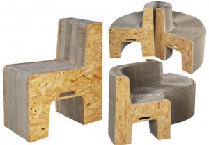
The highlight for me and by far my favourite, was the inspirational stand for Flexible love. Maybe not inspirationally noted for it’s minimalistic back drop , but for its no frills approach and simple demonstration of their purely innovative product, which was grabbing everybody’s attention. The ‘accordion-like’, honeycomb-structured furniture created by Taiwanese designer Chishen Chiu, can hold up to as many as 16 people when fully extended to its 7 metre capacity, and reduced down to a mere 20cm for storage.
Flexible love furniture uses recycled materials and pre-existing manufacturing processes to reduce its environmental impact while pushing the materials to their limits in the most unique way. I did however go to pick it up when fully compact, as the demonstration was being shown with such ease and grace, do not be fooled, it may be honeycomb-structured, but the largest 16 person model weighs in at just under 24 Kg (55 pounds). I do suggest if anyone is thinking of purchasing one for personal use, seriously consider the smaller 8 person model at 12kg in weight, as moving it around would be a serious work out.
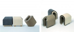
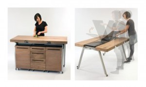
Interiors Exhibitions is not all about ‘the sale’ though and although I did not have time to take in any of the free seminars, I did take some time out to check out the New design Britain finalists. Yu-Hun Kim’s ‘EWE’ Characterised stool using layered hard and soft Felt and Phil Crook’s multi-functional dining station, were my two top favourites, clearly indulging the versatility and sculptural pleasures that furniture can bring.
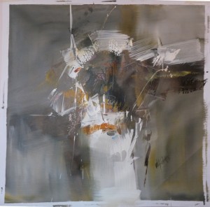
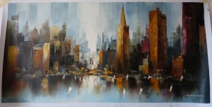
On a personal indulgence, I did, however find some lovely oil canvases to expand my very new art collection for the house (the house we have lived in for 3 years, and after plastering all the walls, most walls are still bare) The first will go in a the final bedroom to be decorated and the City Skyline I have ear-marked for the living room, although both still require framing. If any one has any contacts for Manchester art framers I would be grateful.
