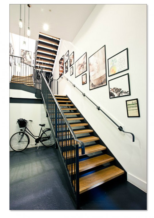
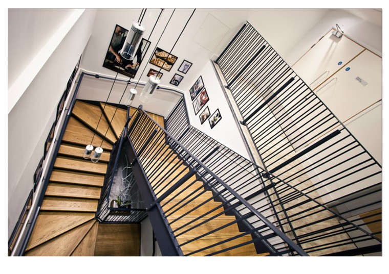
Being an Interior designer is not all about Wallpaper and Curtains, despite what many people may think.  Whilst working for cds-wilman in October 2010 I had the pleasure (with equally measurable anxiety and excitement) of being Lead Design on a Design and Build project for Waitrose Cookery School in London. This included the joyous task of creating a separate entrance from ground level adjacent to the existing Store in the John Barnes Building on the Finchley Road.
Trying to design and install a staircase entrance with passenger lift into an existing space of only 25sqm to reach across 1.5 floors was a first for me. But here is a bit about some of the obstacles I had discovered and thankfully a very satisfactory end result.
The Logistics
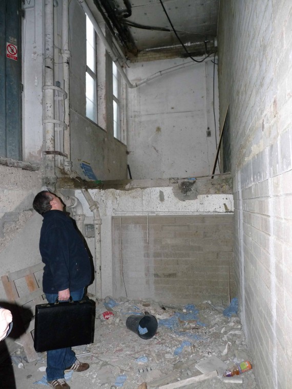
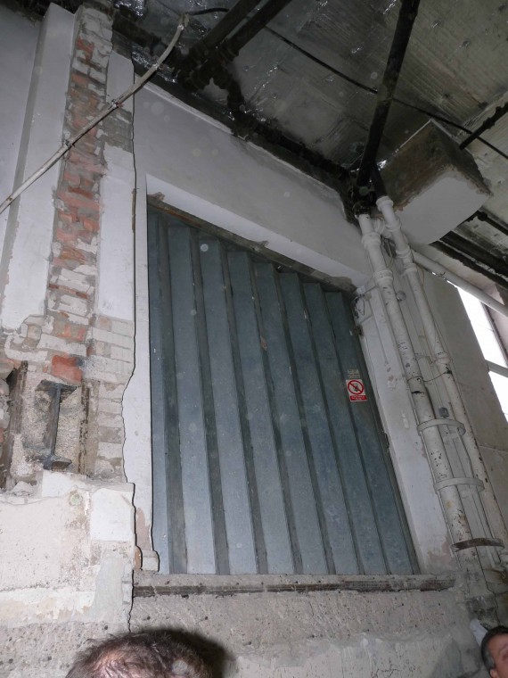
The space earmarked for the entrance was not only compact and situated adjacent to the very busy working supermarket but also hovered half above the Stores basement Parking and the other half over the not so little London Underground. All of this is not to mention the residential flats above.
…….Oh yes and as you can see, it was a shell at best, with no true floor level and a Spaghetti Junction of foul drains which originated from the residential flats. In some areas these had been left unsupported and with no recent drain survey there was no way of knowing which ones were live and which, if any, were redundant. Thankfully there are companies you can engage for such discovery tasks and I was spared the rubber gloves.
We were lucky enough to have a great Mechanical and Electrical Team with years of experience not only in the industry but on this particular building with an earlier project. A wealth of knowledge that is almost never that readily available on every project, and the full co-operation of the residence above made for a relatively smooth transition, considering.
The Design
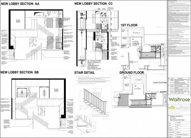
One of the, if not the only design constraints for this area was that the stairs had to correspond with the design which was happening on the first floor. However , the main Cookery School area had initially been designed some months prior, with the understanding that Guests would gain entrance through an existing stair well in the store below. The requirement for the separate entrance was only confirmed after allocation on the First Floor had been earmarked to the requirements of the large plant room and extract filtration systems need to ensure none of the lovely cooking smells from the proposed area emanated to the residence above.
But after several drafts I think the rather convoluted twists and turns incorporated to obtain the best working design can be forgiven, and almost add to the drama. Although this was not all easy as the new public space being created on the first floor did mean a change of use application through local planning and that I would have to ensure the new access space including lift and stairs would conform to the building reg guidelines, a requirement but it did mean the redesigns had to be done with a lot more consideration.
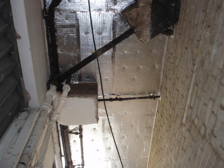
All the designing and planning you can do before starting on site is of benefit but it does not mean there will be no surprises once you do get on site. And nothing stops work on the first day of demolition on the existing goods lift, than the discovery of a bit of good old fashioned Asbestos wedged in the existing lift shaft under the supporting steel to unexpectedly shorten your programme window.
 Installation
I am very pleased with the final aesthetic finishes of the stair case, although some  derived through compromise on budget, the overall feel flows. It captures the Art Deco exterior of the existing building and pulls through the look and feel of the School upstairs with the use of the white oak treads and clean line artwork.
But even with the impact on design and a shortened programme, several teams having to co-ordinate with-in this cramped space it is still to date one of my most favourite areas that I have designed.
I’m just sorry it took so long for me to share it with you.
